Google gave us the Digital Wellbeing tools with Android version 9.0 (Pie). These tools give you an idea about how much time you spend on your phone, most used apps, etc. It also shows other important metrics, such as, the number of notifications you received, and the number of times your device was unlocked, and so on. It is a great way to keep tabs on your usage. However, as of now, you only get a daily summary, and there is no option to export this data.
In this post, we shall look at alternatives that help us get the same information. We shall look at a popular tool, and if that doesn’t work for you, we shall see how to build a quick solution using Microsoft Excel.
1. Analyzing Android activity data with RescueTime
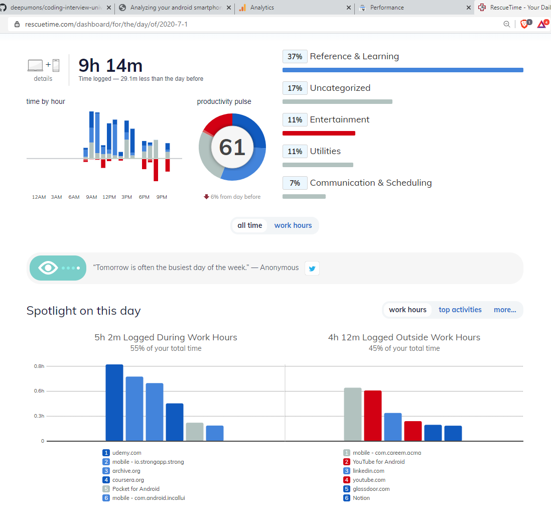
My first choice is RescueTime, which is a fantastic tool to track time spent on your computer, or your phone. Just install the software on your device, and you are set. Soon, you can generate daily, weekly, monthly, and yearly summaries of your usage patterns.
You can find a typical RescueTime dashboard below, which can give you an idea about the data would get.

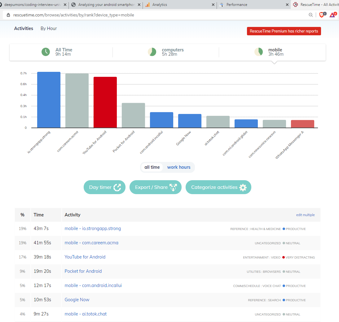
You can also drill down to see just the mobile usage data, which can give you an idea about your most used apps, how much time do you spend on them, and so on.

Rescue time does have some limitations:
- The free version can only show you data for latest 3 months. Your older data is locked away until you opt for the paid version.
- It would take some time to collect enough data for analysis. So, if you are in a hurry, it would be better to build your own solution, which I shall explain in the section below.
2. Analyzing Android activity data with Microsoft Excel
We shall try to get around the above limitations by gathering the historical data that Google keeps on your activity on Android. This post provides guided steps to export and analyze your activity data from your Android phone. We start by exporting the data from Android using Google Takeout. It is then imported to Microsoft Excel. This step is followed by data transformation steps to make the data easier to analyze.
Data acquisition
- Go to takeout.google.com
- Under the ‘Create A New Export’ section, use the ‘Deselect all’ option to uncheck all items. We are only interested in the activity data for Google Android.
- Navigate to ‘My Activity’ portion, and use the check box to select it. Click on the ‘Multiple formats’ button, and change the ‘Edit file format’ option from HTML to JSON. JSON format is more suitable for our needs.
- Now click on the ‘All activity data included’ button. Deselect all options except for ‘Android.’
- Click on ‘Next step’ at the bottom of the page.
- Now you will see the options for ‘Choose file type, frequency, and destination.’
- Select ‘Send download link via email’ as the Delivery method.
- Select ‘Export once’ as Frequency.
- Select the appropriate File type & size as per your needs.
- Press the ‘Create export’ button to start the export process.
The export process may take several minutes, and depends on how much data you have. You will get the download link in your email once the export is done. Click on the link to download the exported data to your local drive. You then need to extract the data before you can import it to Microsoft Excel.
Preliminary analysis of the data
Let us have a look at the extracted data to get an idea about what we are dealing with. Open the exported data in your favorite text editor. It should resemble data given below.
},{
  "header": "YouTube",
  "title": "Used YouTube",
  "titleUrl": "https://play.google.com/store/apps/details?id\u003dcom.google.android.youtube",
  "time": "2020-04-18T15:00:17.361Z",
  "products": ["Android"]
},{
  "header": "POCO Launcher 2.0- Customize,  Fresh \u0026 Clean",
  "title": "Used POCO Launcher 2.0- Customize,  Fresh \u0026 Clean",
  "titleUrl": "https://play.google.com/store/apps/details?id\u003dcom.mi.android.globallauncher",
  "time": "2020-04-18T12:48:56.349Z",
  "products": ["Android"]
},{
  "header": "Instagram",
  "title": "Used Instagram",
  "titleUrl": "https://play.google.com/store/apps/details?id\u003dcom.instagram.android",
  "time": "2020-04-18T12:47:54.855Z",
  "products": ["Android"]
},{
There are many attributes in each of the JSON data element, but we are interested in the ‘header’ and ‘time’ attribute. The header refers to the name of the application, and time refers to the time when it was started. There is no ‘End Time’ in these attributes, so we won’t know for sure for how long that application was in use.
In my analysis, I noticed that the launcher application starts when the phone goes to standby mode. This happens like clockwork during night time, and idle hours during the day. If we discount these hours, we get the actual hours of use of the phone. This would segregate the use between standby and non standby hours, but keep in mind that this does not translate to screen-off, and screen-on times.
To make the analysis simple, I am going to consider the start time of one application as the end time of the previous application. This means that the usage hours from this analysis would be much higher than your ‘screen on’ time for these application. This is a big caveat, but it can give us a reasonable estimate of the run time of an application. So, it goes without saying that you need to look at the output of this analysis with a pinch of salt.
Importing the data to Microsoft Excel
Open Microsoft Excel and follow the steps below:
- Open a new blank workbook.
- Go to the Data tab, and go to Get Data -> From File -> From JSON from the menu. Navigate to the “My Activity.json” file that you had downloaded, and click open. This would open the file in the Power Query Editor.
- Use the “To Table” option to convert the list of imported records to a table. In the prompt that follows, select the delimiter as ‘None’, and handling extra columns as ‘Show as errors’. Press OK.
- Press the Expand Column button on the top right corner of the column header. Select ‘header’ and ‘time’ from the the selection dialog box and press OK. This will expand the header and time columns while discarding the others.
- Rename to the header column to ‘Application’, and time column to ‘StartTime.’
- Change the data type of the StartTime column to ‘Date/Time.’
- Press the down arrow button on the top right corner of StartTime column, and navigate to Date/Time filters -> Year -> Last Year. This would filter all the records that were generated last year. Alternatively, you can change the filter to select a period that you are interested in, such as, weeks, months, or quarters.
- Press the ‘Close and Load’ button.
This would close the Power Query Editor, and load the data to your workbook.
- Make sure the StartTime column is sorted in descending order. You can make use of the ‘Sort Z to A’ button under the Data tab to do this.
- Copy and paste this data to a new sheet. Make sure you use the “Values and Number Formatting” option to do this. This will discard the table formatting from the earlier sheet.
- Copy and paste the StarTime data into a new column, in such a way that the records start from the second row after the header. This sets the StartTime of a record as the EndTime of the previous record, which is what we want.
- Rename the new coumn as EndTime.
- Delete the two orphran rows without EndTime. This would be the first and last records in our data set.
- Convert the dataset to a table using the ‘Table’ option under ‘Insert’ tab. This would make it easier to prepare the data, and additional columns using DAX formulas.
- Create a new column called TimeDifference using this DAX formula: =[@EndTime]-[@StartTime]
- Create additional columns called Hours, Minutes, and Seconds with these formulas: =HOUR([@TimeDifference]), =MINUTE([@TimeDifference]), =SECOND([@TimeDifference]). This computes the differences in hours, minutes, and seconds between the given StartTime and EndTime.
- Create a TotalHours column, that combiles the hours, minutes, and seconds into a single value in hours. This would make our analysis much easier, as we are dealing with large data spread across many weeks, months, or even a year. DAX formula: =SUM([@Hours]+[@Minutes]/60+[@Seconds]/3600)
- Quickly go through the TotalHours data to see if there are any anomalies. You can use the column level Filters, or a Pivot Table for this purpose. Remove anomalies that that you may find.
Data Analysis
Your data is now ready for analysis. I would recommend using a Pivot Table, or Pivot Chart in Excel to carry out the analysis. Do go through the data, and assign categories to each application to make the analysis more interesting. You can also export this data to your favorite data analysis platform such as Power BI, or Tableau to help with the analysis.
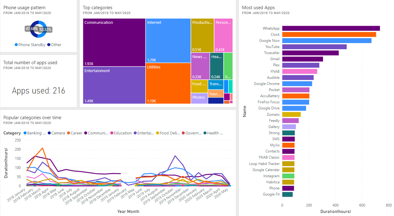
Now let’s have a look at some of the charts that were generated using Power BI, and see if we can gain some insights.

Phone standby times
My phone stays idle, or in standby mode for roughly half of the day. This is true for all years except for 2020, where the standby time is increased to 64%. I have made a conscious effort to reduce my phone use this year, I believe that is what is causing this drop in active use.
Top Applications
WhatsApp happens to be my favourite app by a long mile. This comes as no surprise, as most of my messaging happens on WhatsApp.
The clock application coming after WhatsApp is an anomaly. I reckon this is because clock is often the last used app -when I set my alarm- before I turn in for the day. This might be causing the long hours under clock, so we can safely ignore it.
Google Now is the second most used app. I realise now that this is the first app that I check for local news, my schedule, upcoming appointments, and so on. I am very fond of this app, and it shows.
YouTube is another app that eats up a lot of my time. This is in addition to the time spent on my laptop, so I guess it is time to cut back on it.
There is nothing significant about the remaining apps, so I shall not go in to those in detail.
Category usage over time
This chart has a large chunk of data missing between Jan/2019 and May/2019, which needs to be investigated. I was using my smartphone as a wireless hotspot during this period. I wonder if that has got something to with this finding.
Top Categories
My top three categories are Communication, Entertainment, and Internet. It was surprising to note that I still use my phone mostly for Communication (voice calls, and messaging). Entertainment coming in second is not a surprise considering YouTube is my third most used app. Similarly, catching up on news, and web browsing makes up most of the activity for Internet category.
I was curious about my Camera usage, so this is where I turned my attention next. It appears that I use my camera only occasionally, so splurging on a triple camera shooter -as is the trend these days- is not going to help me much. The remaining categories were in line with my expectations.
Total apps used
There was a total of 215 unique apps installed, and used over this three-year period. That’s a lot of apps! Perhaps it would be a good idea to be more mindful before installing new applications.